

regarding overly evocative ig fonts
regarding overly evocative ig fonts
it may have come to your attention that there are now hundreds, if not thousands, of fonts at one’s disposal when captioning an instagram story. okay, there are only 9. yet there are still too many, considering the fact that none of them are wholly satisfying. each, in its own specific way, reminds me of one of those mystifying forever 21 garments that would be workable if it weren’t for a small appliqué reading “LA” or “Good Vibes Only” located on the back shoulder.
let’s dig deeper into what exactly these fonts are telling us.
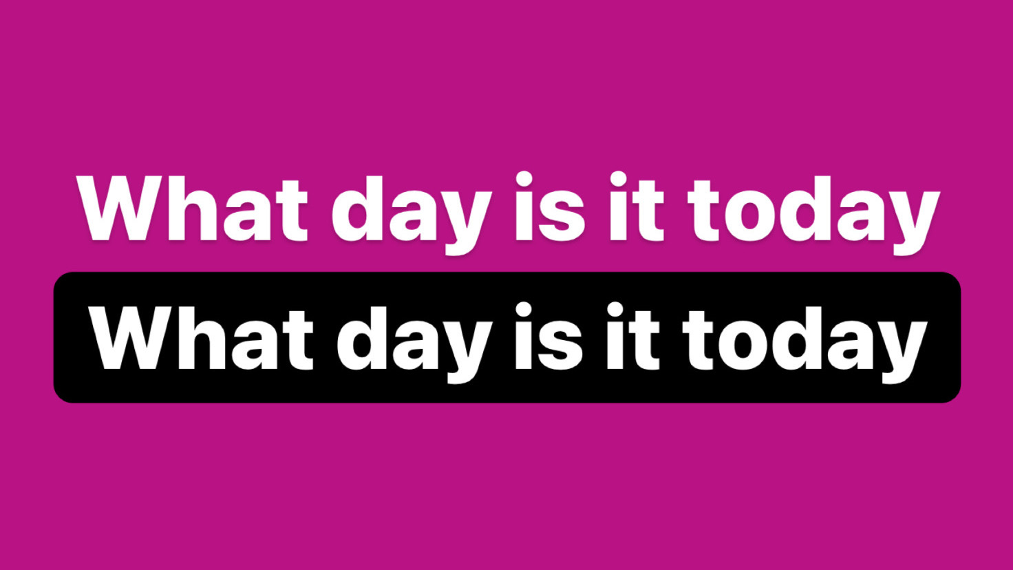
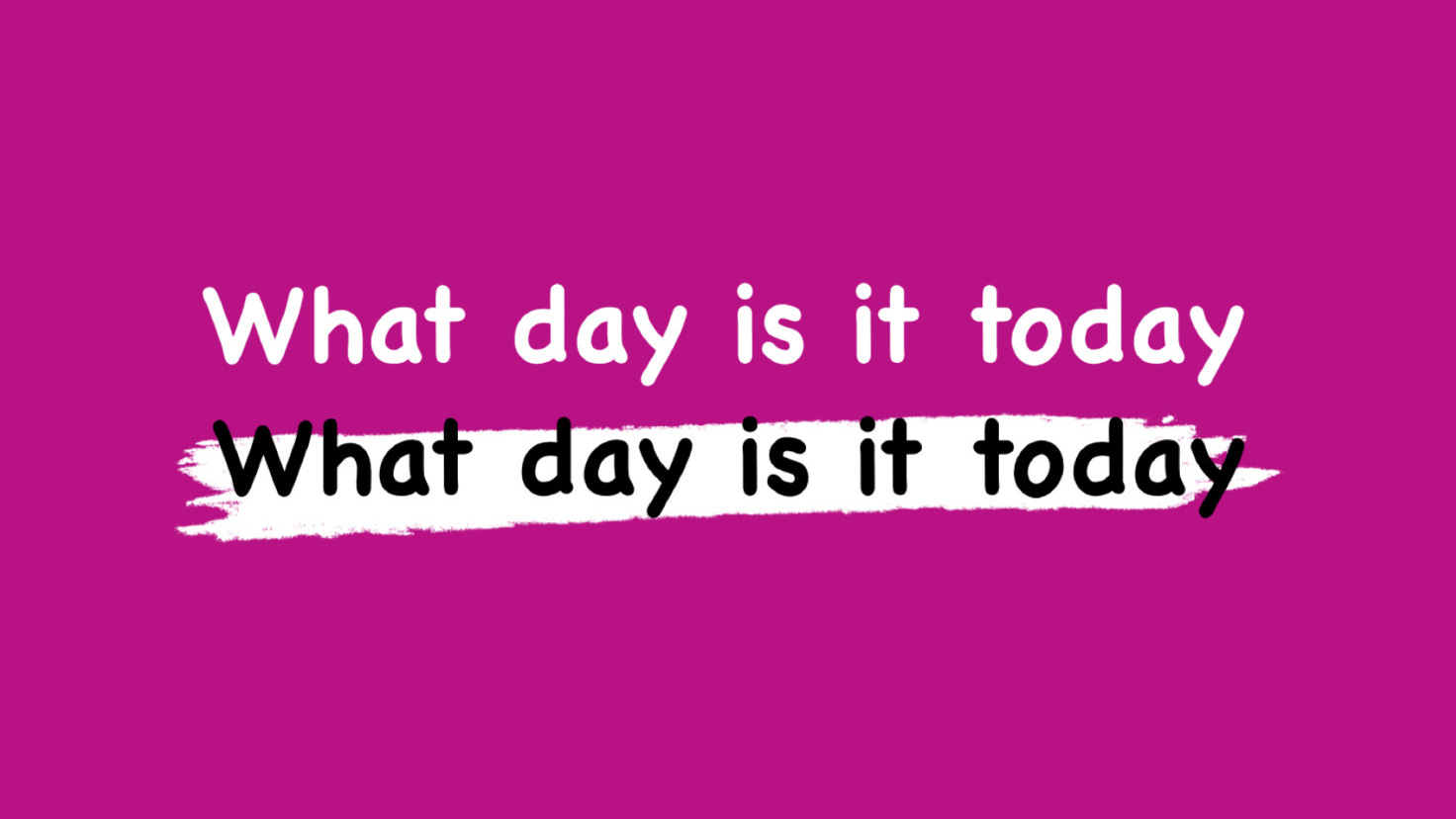
intended user: cowards like me who fear that every option is too evocative
commentary: absolutely standard, yet not in least satisfying. it’s the font equivalent to how we felt about cow’s milk in 2005. there’s better out there, but why venture into the unknown if you find comfort in what’s familiar?
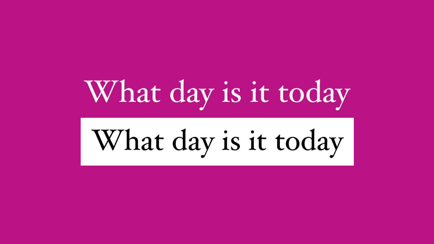
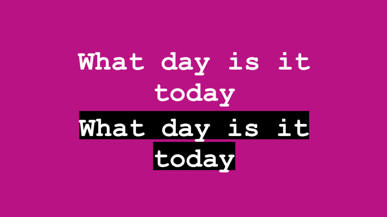
intended user: college paper editor-in-chief
commentary: in my bones i feel that instagram stories should be a serif-free space, so naturally this font enrages me, makes my skin crawl. it feels far too self-serious and dated for this platform and in particular, for the silly quotidian images we share to story.

intended user: an influencer who posts roundups of different “unique” snacks you can find at disneyland
commentary: despite not feeling personally aligned with this font, i do respect it — it seems to have a defined sense of self. “why should i have a colored background just because every other font does? make me GLOW!” every time i test it out on an image i’m about to post, i end up recoiling from its always too intense whimsy.
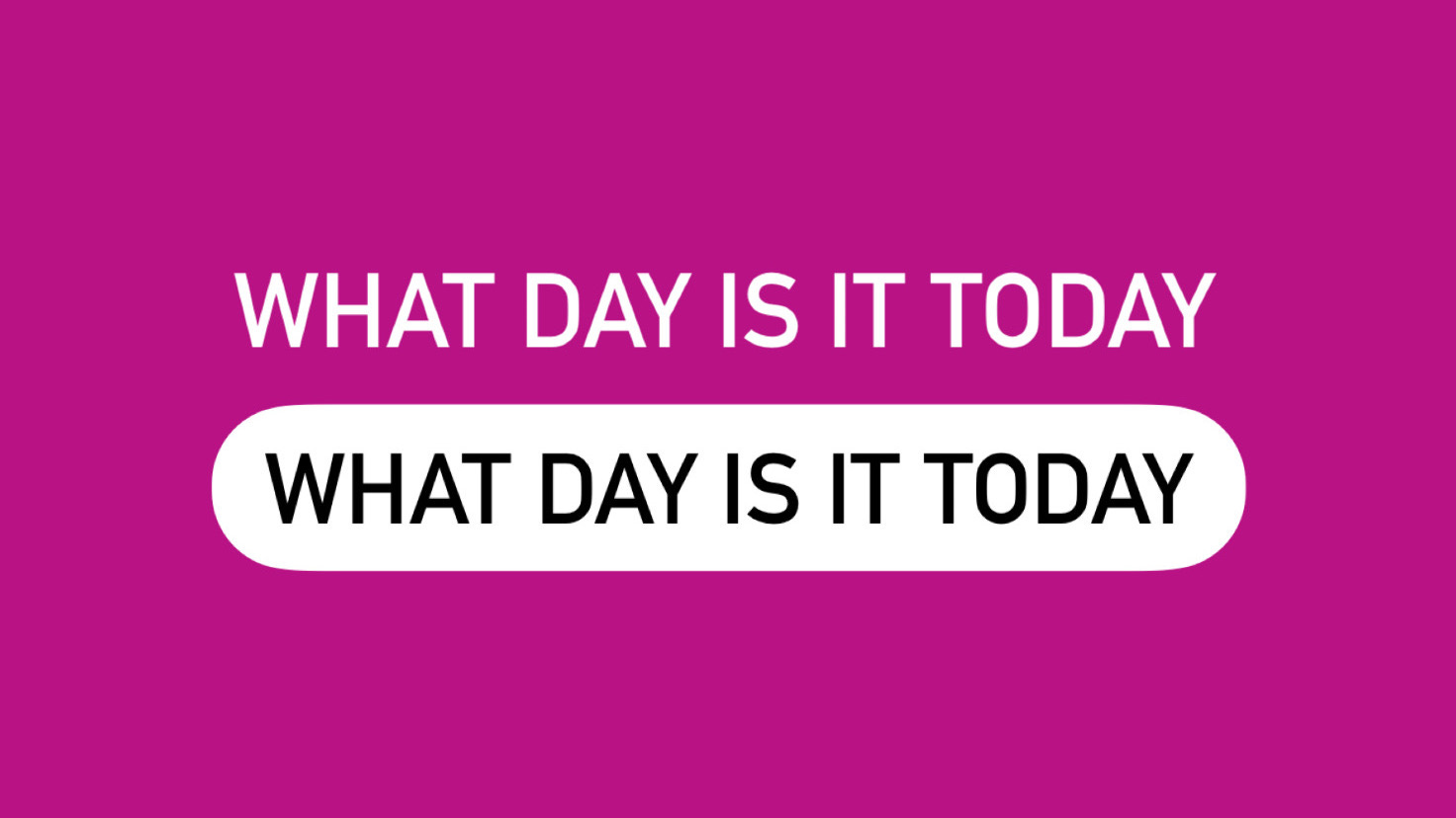
intended user: small business owner with new products to announce
commentary: this one is pretty harmless, but it’s our first of two fonts that is perma-caps lock. bizarre energy. if it weren’t for the uppercase, it would probably be the best of the bunch.

intended user: small business owner with a “once quarterly” sale to announce
commentary: essentially just a doubling down on the previous font. it’s comparative boldness makes it less pleasing to the eye and the lack of totally round corners on its background makes it slightly less approachable.
intended user: former preschool teacher who now makes a living off of posting read-along videos
commentary: if i hadn’t experienced the comics sans craze on tumblr in the ‘10s, i would probably favor this font for my own ig stories. the god awful paint-slashed background option harshens the blow, though. everything about the uneven brushstroke looks wrong.
intended user: 16 year old whose parents didn’t buy her the typewriter she wanted for hanukkah
commentary: instagram’s penchant for analog-reminiscent type styles doesn’t sit right with me. it’s impossible to look at a photo of a cake someone on the other side of the world took out from the oven moments ago and indulge in the fantasy of an old-timey font at the same time.
i need some kind of blocker that makes it impossible for my screen to display the courier font outside of screenwriting software. in that context, it feels nice and aspirational — almost like you’re LARPing as a 1980s local news journo — but anywhere else it’s hard to ignore how out of place the font looks on screen.
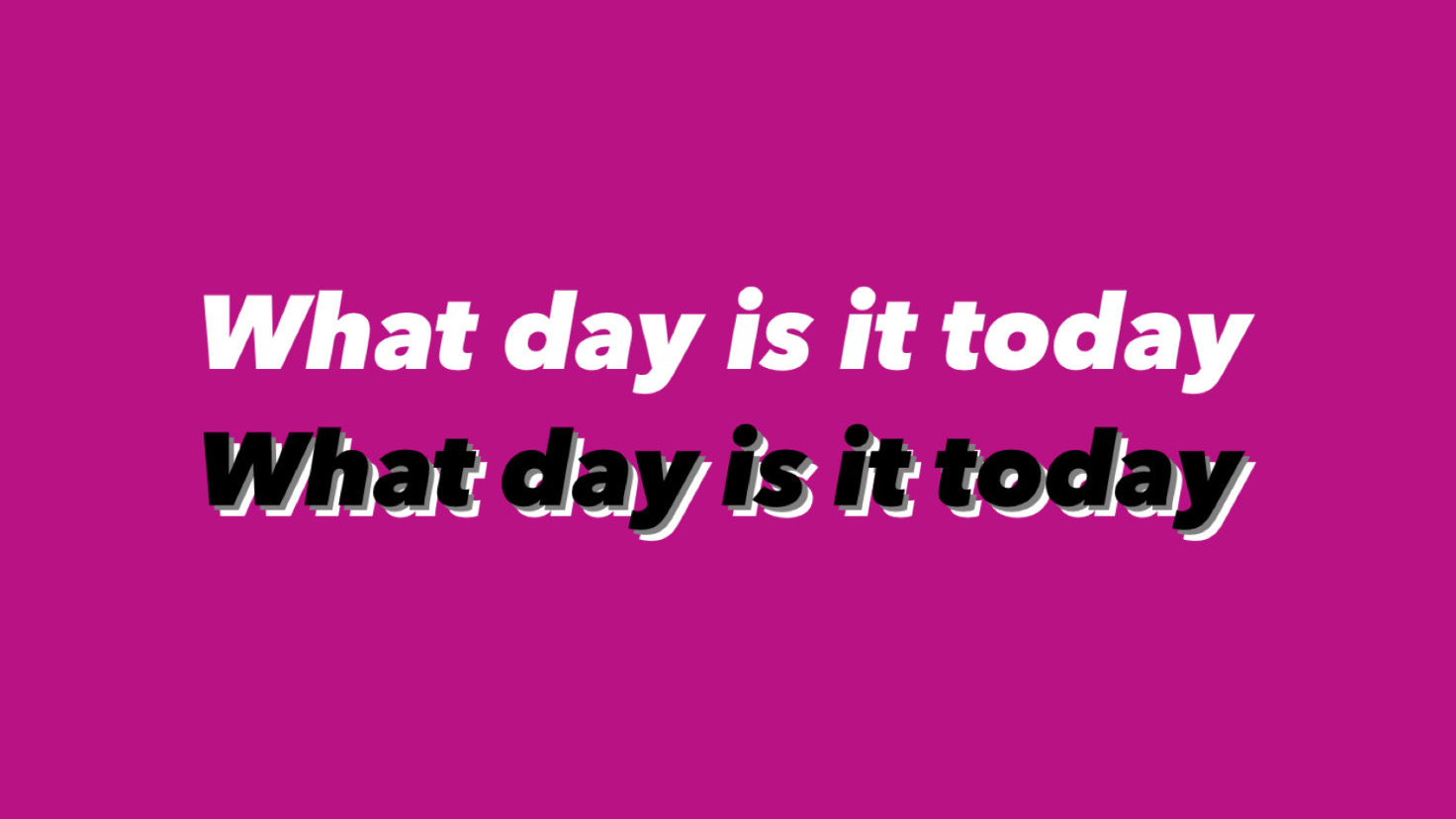
intended user: someone who’s feeling playful, but not too playful
commentary: grown bored of the first font in this list? looking to dip a toe in the water of the more flashy font offerings? this font and its hot little shadow will allow you to play around a bit without committing to an entirely new personality.
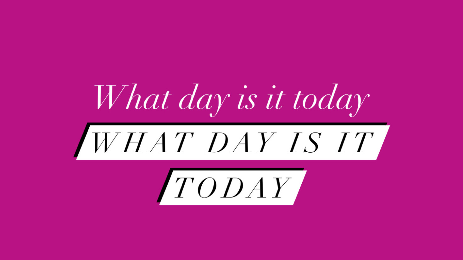
intended user: your best friend from high school who would always talk about going to paris with her grandmother
commentary: oof, another serif. this one comes off more posh and feminine than its paper-of-record-reminiscent cousin from earlier in the list. it’s extreme delicacy begs you to lean in for a closer look, especially when paired with a background color too similar to its own hue. it’s hard not to imagine a 2009 fashion blog taking to this font.

click the pic to fill out the recommendation request form!